Sunday, August 14, 2011

martial arts, global warming, and chance.

Scientific knowledge is produced piece meal through the slow process of research. One particular challenge in this process occurs when a researcher observes a difference between the experimental group and the control group. Did the difference arise because of chance or because of the experimental condition? Consider a child psychologist who is attempting to discern the most effective method for modifying explosive behaviors in children (say, ages 5 to 8). She designs a study in which the control group receives standard family counseling intervention while the treatment group receives standard family counseling plus Aikido martial arts training.
Suppose that the counseling + Aikido group exhibits a greater average reduction in explosive behaviors than the counseling alone group. What should the psychologist conclude? Was the difference really due to martial arts training? Or was there simply random variation between the two groups?

The observable world (a.k.a. the phenomenal or that which is accessible by our five senses) is characterized by variation. The world does have unifying undercurrents, however on the whole a vast multitude of divergent atomic structures abounds. In short, all things are not the same. There are alkali metals, alkaline earth metals, inert transition metals, transition metals and post-transition metals. There are tall people, short people, fat people, skinny people, brown skinned people, olive skinned people, red haired, brown eyed, toothy and toothless. Botanically, there are at least 40 different types of daffodils; each type of daffodil itself has a wide range of variable characteristics. This variation is what statisticians refer to when they use the terms "random error" or "random variation." On the other hand, variation due to some factor (e.g.: medication, exercise, psychotherapy, air pollution, etc) is referred to as explained variation. For example, consider an experiment which showed that lower carbon pollution levels curiously cause increased average temperatures in a simulated atmosphere.
Researchers want to know if this temperature variation is explained by reduced carbon pollution or by error (random variation). A high degree of variation in temperature recordings collected during the experiment may indicate that the average increase in temperature was a chance finding. In other words, if the variation in temperatures is great, then it may be that the researcher simply collected data during a time when temperatures were varying on the high end of the thermometer. Below I will show how the statisticians would answer the question, "Is the temperature rise due to the decreased carbon pollution or due to chance variation?"

When analyzing data sets from an experiment/study, researchers want to know if the observed change is a chance finding or a true reflection of how things really are. To do this they use a statistic called standard error (a quotient of standard deviation divided by the square root of the study sample size) to predict how variable the sample average would be if the experiment were repeated a large number of times. Essentially, the standard error statistic is used to calculate a range of values (termed "confidence interval") in which the researcher can be 95% confident that the true population average lies. Consider the atmospheric temperature study above. If the average temperature increased by 3.0 degrees Celsius, but the 95% confidence interval was -0.3 to 8.2 then it is entirely possible that no temperature change happened whatsoever (note that the value "0" is included in the range...indicating that the true average change in temperature may be 0 degrees Celsius). Such a scenario would indicate that the increase in temperature may truly be due to random variations or chance, not due to reduced carbon pollution.
Further testing can be done viz a viz Fisher's all powerful p-value to determine how insignificant the temperature rise truly is. In fact, selecting levels of significance and calculation of p-values will be the topic of next post. From there I will switch out of statistics mode and into philosophy mode.

Saturday, August 13, 2011

descriptive stats revisited

Last post I attempted a brief and somewhat unclear introduction to descriptive statistics. So by way of review I will summarize last post with a graph to help depict things. The three most basic ways of describing a data set are its average, spread and shape. These three concepts are very important as performing statistical analysis depends on these three descriptions of the data being "normal." The average of the data set represents where the majority of the data lie. A normally distributed set of data (referred to as a bell curve when plotted) will have an obvious mean at the peak of that curve. See how on the normal curve below, the line representing the mean divides the curve into two symmetric halves.

The spread of the data indicates to what degree all the data points vary away from the average. Standard deviation is a number that indicates the average distance of all data points from the average. Higher standard deviations indicate that the range of data spread further on either side of the average. See the lines on either side of the central average line on the graph below? The first line on either side of the average line indicates a point that is 1 standard deviation from the mean. The next line indicates a point that is 2 standard deviations away from the mean. Particular to the normal bell curve is the reality that 67% of all data will be only one standard deviation from the mean and 95% of the data only 2 standard deviations away from the mean.

The shape indicates whether the bell curve has a long tail to the left [negative skew], long tail to the right [positive skew], tall curve [leptokurtic], flat cruve platykurtic). Any distortion of the bell curve impacts statistical calculations as basic statistics assume a normal bell curve. See below for depictions of skewed data.

Next post I will answer the following question: how do we know if the difference between two groups or two measurements is due to chance or due to skill or treatment effect?

Thursday, August 4, 2011

redlegs and descriptive stats

Honestly, my appreciation of baseball is pathetic. That is a veritable reality (as those acquainted with me can attest). However, as a youth I followed Redlegs baseball compulsively. Sunday mornings were great because the Cincinnati Enquirer would have an expanded sports section with all the breakdown of player and team stats (this was before the dawn of ESPN.com/mlb/statistics....in a former age when all fans waited with baited breath for our information to arrive through the paper delivery man). Batting averages, ERA's, standings, etc. Typical of my analytic approach to things, I would perform my own calculations to see how many hits Hal Morris would need to break .400 over the next 50 at bats. Much has changed since my youth, but I still gain a good deal of satisfaction in performing calculations. For those who might find such a thought foreign or even perverse, I will frame this post on summary statistics around baseball. Perhaps no one will even notice that math is being conducted.

Data collection is the process of compiling bits of information (e.g.: number of hits, innings pitched) in an organized system (I personally prefer Excel for its ubiquitous use). Without doing at least some basic calculations the data are not very meaningful. Summary statistics are employed to describe several qualities of the data: location, spread, and shape. Location captures where the majority of the data lie (e.g.: the team batting average represents a central number around which most of the players on a baseball team are averaging). Spread captures how widely the data varies (e.g.: once the location is known we want to know how big the difference is between the worst batting average and the best batting average). Shape captures how closely a graph of the data resembles a bell shaped curve (e.g.: if the batting average is relatively high compared to the spread of individual batting averages then the shape will be abnormally tall and departs from a normal bell curve). In statistical jargon these three qualities are referred to as: mean, variance and skewness/kurtosis. (WARNING: those who experience anxiety when exposed to mathematical formulas should skip over the next paragraph...you won't miss much).


Mean is the sum of the data divided by the number of data points and is denote by the upper case "Y" with a line over it in the equation:
    • YBAR = SUM[Y(i)/N] where the summation is for 1 to N.
  • Variance is the square of each data points distance from the mean, all summed and divided by total number of data points minus 1. The square root of variance can then be taken to reflect the average distance that data points vary from the mean

      s = SQRT[SUM(Y(i) - YBAR)**2/(N-1)] where the summation is from 1 to N.

    Skewness is obtained by the cubed value of (the mean subtracted from each data point), summed for all data points and then divided by the product of (total number of data points minus 1) and (the cube of standard deviation). skewness = SUM(Y(i) - YBAR)**3/(N-1)*s**3 where the  summation is from 1 to N 
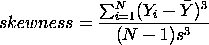
When this number is significantly positive then the data is not normally shaped and is lopsided to the right; when this number is negative then the data is lopsided to the left. Kurtosis is obtained similarly to skewness only the numerator is taken to the 4th power and standard deviation in the denominator is taken to the 4th power
    kurtosis = SUM(Y(i) - YBAR)**4/(N-1)*s**4 where the  summation is from 1 to N
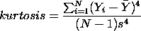
. A significantly negative kurtosis number indicates a flat curve and a positive kurtosis number indicates a tall, lanky curve.


    Why are descriptive statistics important? There is a phenomenon out there in the sports world known as fanaticism. A true baseball fanatic will go to extreme lengths to stand by her team. It is even conceivable that during pleasant interchange over brews she may overstate or even understate the skill level of her team. In the world of statistics we call this bias. Descriptive statistics help us to reduce the influence of bias and see things more like they really are. No matter how devoted I am to the Redlegs offense, if I compare a variety of reliable offensive indicators to the same indicators for the Cardinals, I will find out the truth of how well they compare. If we compare the two teams and find that the Redlegs have better numbers and that the difference between the two teams is not due to chance, then I may not only brag as a fanatic but as a man who knows the statistical truth ("statistical truth," is that an oxymoron?).

    So that raises a question, how would I know if the better Redlegs numbers were due to chance or skill? Tune in to next post for a breathtaking answer.